
A screen mounted in the right place, showing the right metrics, becomes what engineers and agile teams call an information radiator: an always-visible, always-current display that keeps everyone oriented without any active effort on their part. You glance up, you know where things stand, you get back to work.
The good news is that setting this up has never been more accessible. The combination of cloud-based BI tools, inexpensive media players, and purpose-built signage software means you don't need an IT department or a large budget to get a professional KPI dashboard on the wall of your office. A small business can do it for under $200 in hardware. An enterprise team can roll it out across dozens of locations from a single dashboard.
This guide walks you through the entire process — from deciding which metrics actually belong on a shared screen, to choosing the right hardware and software, to designing a display that people will genuinely look at.
Below we’ll be covering:
- Why putting KPIs on digital signage in your office just makes sense
- How to determine what KPIs to display
- Ways to keep information fresh and maintained
- The only digital signage solution you need
Displaying KPIs on digital signage: Why this works so well
Putting updated KPIs on digital signs in the office is important for employees

Data that nobody sees might as well not exist. You can have the most sophisticated analytics stack in your industry — beautifully structured databases, meticulously maintained pipelines, expertly designed dashboards — and if the people doing the work never look at them, none of it moves the needle. Digital signage solves the last-mile problem of business intelligence: getting the right numbers in front of the right people, passively and continuously, without requiring anyone to go looking for them. This is why displaying KPI on digital signage works so well.
Real-Time Awareness Without Meetings or Email
The traditional alternatives to shared dashboards are slow and noisy. A weekly KPI email requires someone to compile it, someone to open it, and everyone to mentally translate last Tuesday's numbers into today's reality. A recurring metrics meeting burns collective time and is already out of date the moment it starts. A Slack message with a screenshot gets buried within hours.
A well-placed digital signage display sidesteps all of that. The numbers are just there — updated automatically, visible at a glance, requiring zero action from anyone on the team. When something spikes or drops, people notice in real time, not at the next all-hands. That speed of awareness is what separates teams that react quickly from teams that are always catching up.
Motivation and Accountability Go Up When Progress Is Visible
There's strong behavioral research behind the idea that visible progress drives performance. Psychologists call it the "goal gradient effect" — people work harder and with more focus as they can see themselves getting closer to a target. A sales team that can see the day's revenue climbing toward a goal behaves differently than one that checks a CRM report at 5pm. A support team watching their ticket resolution rate in real time responds differently to a backlog than one that gets a morning summary email.
Visibility also creates natural accountability without the need for micromanagement. When metrics are shared openly, performance becomes a team conversation rather than a manager's private concern. People notice when numbers are off, ask why, and often self-correct before anyone has to intervene. That kind of ambient accountability is healthier and more effective than top-down pressure.
Where This Works Best
Digital KPI signage isn't equally valuable everywhere. It shines brightest in environments where the work is fast-moving, goal-oriented, and team-based. Some of the most common and effective applications include:
- Sales floors, where real-time revenue, pipeline, and quota attainment displays drive daily motivation and healthy competition
- Operations and logistics centers, where throughput, error rates, and SLA compliance need to be monitored continuously across shifts
- Customer support teams, where queue depth, response times, and CSAT scores are highly time-sensitive
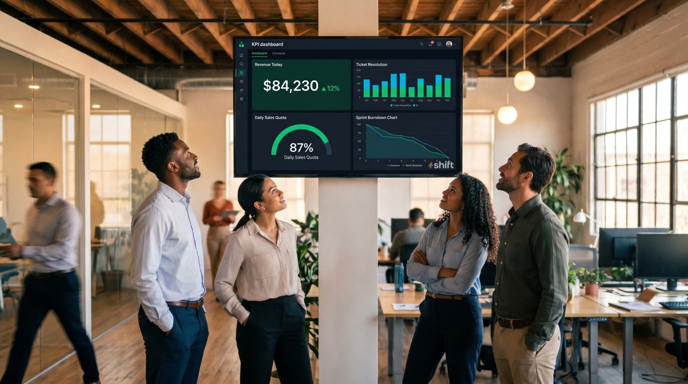
- Software development teams, where CI/CD pipelines, uptime, error rates, and sprint burndown charts benefit from passive visibility
- Retail and hospitality environments, where foot traffic, transaction volume, and service times affect decisions made on the floor in real time
Define the KPIs you want to display
Be sure to choose the data you display on your digital signage carefully

It's tempting to jump straight to screens, software, and hardware specs. Don't. The single biggest reason office KPI displays fail isn't a technical problem — it's a content problem. Screens get ignored, or worse, actively tuned out, because they're showing the wrong metrics to the wrong people in the wrong way. Before you mount a single display or open a single dashboard tool, spend time getting clarity on what actually belongs on the wall. Every decision you make about technology should flow from that.
Choose KPIs That Are Actionable, Not Just Impressive
There's a meaningful difference between a metric that looks good in a board presentation and a metric that changes how someone does their job today. Digital signage is most valuable when it displays the latter.
An actionable KPI is one where, if the number moves in the wrong direction, someone in the room can do something about it right now. Ticket queue depth is actionable — a support rep who sees it climbing can prioritize accordingly. Monthly recurring revenue is informative, but a frontline employee can't directly act on it in the next hour. That doesn't mean strategic metrics have no place on a display, but they should be paired with the leading indicators and operational metrics that actually drive day-to-day behavior.
A useful test: for every metric you're considering, ask "if this number changes right now, who notices, and what do they do differently?" If the answer is "nobody" or "nothing," it's probably not the right thing to put on a shared screen.
Match Metrics to the Audience in Each Area
A single dashboard for the entire company sounds efficient, but it often means the display is equally irrelevant to everyone. The metrics that matter to a warehouse picking team have almost nothing to do with the metrics that matter to the marketing team two floors up. Effective KPI signage is audience-specific.
Think about who walks past or works near each screen throughout the day. What decisions do those people make? What does a bad day look like for them, numerically? What would they want to know the moment they arrive in the morning, or check after lunch? The answers should directly determine what appears on that screen.
Some practical examples of audience-matched KPI displays:
- A screen near the sales team shows daily revenue vs. target, open opportunities by stage, and individual quota attainment
- A screen in the engineering area shows deployment frequency, error rates, open incidents, and sprint progress
- A screen in the customer support area shows current queue depth, average handle time, first response time, and CSAT score
- A screen in a warehouse or fulfillment center shows orders processed per hour, error rate, and shift target vs. actual
- A screen in a shared all-hands area might show company-wide metrics — monthly growth, NPS, or headline revenue — that give everyone a sense of the bigger picture
Avoid Dashboard Clutter — The 3–5 Metric Rule
More is not more when it comes to shared displays. The instinct to justify a screen by filling it with every available metric is understandable but counterproductive. A display crowded with twelve KPIs, three charts, and a scrolling data table communicates nothing clearly. People do a quick visual scan, find no obvious focal point, and move on.
Cognitive load is real. When someone glances at a screen for two or three seconds — which is about all you get from a passing employee — they can absorb only a small number of values. Design for the glance, not the deep read.
A practical rule of thumb is to limit any single screen view to three to five metrics. Each one should be large enough to read from across the room, accompanied by enough context to be instantly interpretable (a target, a trend arrow, a color indicating status), and nothing more. If you have more metrics worth showing, consider rotating through multiple views on a timed cycle rather than cramming everything onto one screen at once.
Keeping your KPIs fresh is essential
No one wants old or stagnant KPIs on their dashboard
Getting your KPI dashboard live on a screen is a milestone, not a finish line. The displays that deliver lasting value are the ones that are actively maintained — updated, reviewed, and occasionally reinvented as your team and business evolve. The ones that get ignored, unplugged, or papered over are almost always the ones that were set up once and never touched again. Building a simple maintenance practice around your signage is what separates a genuinely useful information system from an expensive screensaver.
Schedule Regular Reviews of Which KPIs Are Displayed
Business priorities shift. A metric that was critical during a product launch may be irrelevant three months later. A KPI your team was struggling with last quarter may now be so consistently healthy that watching it adds no value. Goals get hit, strategies change, new initiatives emerge — and your displays should reflect all of that.
Build a recurring calendar event, even just once a quarter, to step back and ask whether what's on the screen is still the right thing to be showing. Treat it like a content audit. Go through each metric and ask the same question you asked when you first chose it: if this number changes today, does anyone in this room do anything differently? If the answer has become no — because the metric is now stable, no longer relevant, or no longer owned by the team near that screen — replace it with something more current.
Automate Data Connections to Avoid Stale Numbers
Nothing kills trust in a KPI display faster than numbers that are obviously wrong or out of date. An employee who notices that the "today's revenue" figure hasn't moved in six hours, or that a metric is showing last week's data, will stop trusting the screen entirely — and once that trust is gone, it's hard to recover.
The best defense against stale data is automation. Wherever possible, your dashboard should be pulling live data directly from its source system through an API or native integration, with no manual steps in between. A sales dashboard connected directly to your CRM updates itself. A support dashboard pulling from your ticketing system reflects reality in real time. A financial metric fed by a manual CSV upload that someone has to remember to run every morning is a reliability risk.
Turn to Shift to display your KPIs on digital signage in your office
Shift is your solution to keep relevant KPIs organized and easily viewable

It’s simple to keep everyone aware of key KPIs that are automatically updated when you go with Shift digital signage. To get started, you just plug and play using the media player and your digital TV signage—the set up is designed to be up and running in minutes, no IT department required. You can utilize templates to create all kinds of communication content, as well as display KPIs using real-time data.
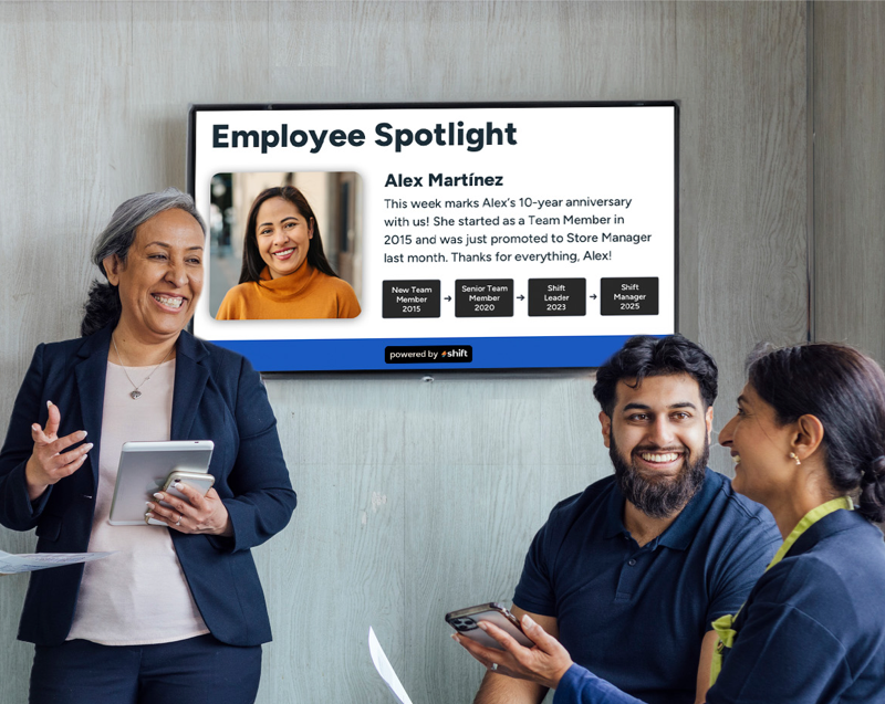
Share key updates, recognize team members, or use current KPIs to motivate employees. Offices that utilize Shift’s digital signage not only see a boost in productivity, but an increase in revenue and employee retention.
Will you harness the power of Shift and display KPI dashboards in your office?
Getting your KPIs off the laptop and onto the wall is one of the highest-leverage, lowest-overhead improvements you can make to how your team operates. The technology is accessible, the setup is straightforward, and the impact — faster awareness, stronger alignment, and a culture where performance is visible and shared — is immediate.
Start small. One screen, one team, five metrics. Get it right in one place before rolling it out everywhere. The habits and decisions you build in that first deployment — choosing the right KPIs, designing for readability, assigning ownership, keeping the data fresh — are the same ones that scale across an entire organization.